Friday, April 24, 2015

FIRST EVER PROCESS VIDEO

A few people have asked if I do process videos and so far the answer has been no. I've tried making them but when speaking English I just stumble over my words. Then I saw this process video by Sockergrynet and realized - hey! I don't have to talk.

Now keep in mind this is my first time making and editing a video - ever! It's badly lit, my head pops into the frame several times and it's just a video-no fancy signs or zooms or anything. I'll be working on making them better and better.

Here is the spread I made: 


I did record the making of both pages, but on the second page my head was in the frame way too much so the video only contains the maiking of the left side of the spread. Nothing was planned beforehand. I had only printed the photos. I wanted to show you my entire process of picking out which cards to use, because I often miss that part when watching process videos. So often it's all already planned out and prepared you don't actually get to see the difficult part of the process. 

So here's my video!


I hope you enjoyed my post today. Have a lovely weekend friends!

/Magdalena

Friday, April 17, 2015

CIRCLES

Nicole Reaves posted some really cool circle layouts in the Studio Calico gallery this week, and I was super inspired! I picked out a few photos from the different things we did at Easter and used the cookie cutter tool in PSE to crop them into circles. Since I was planning to use my 2" circle punch I made the photos slightly bigger than that.

I wanted to incorprate the photos into the text and considered different ways of doing this. After deciding on on a random pattern I laid the photos out on a piece of letter size cardstock. I took a picture with my phone and uploaded it to PSE. I went through the same process as when I print on my PL cards except I just printed it out on white cardstock.

I pictured a rectangle around the text and chopped off the photos that crossed the imagined lines and added some yellow patterned paper underneath all the photos.


Materials: patterned paper from the Sandlot kit, sticker from the On The Grid class kit, thickers from unknown addon kit

/Magdalena

Thursday, April 16, 2015

MONTH IN REVIEW LAYOUT

Every Sunday there's a new sketch presented at the Studio Calico blog. I often mean to create something from them - I even have an entire Pinterest board dedicated to sketches - but I so rarely end up using them.

April Foster's Bday layout was my favorite layout from the Lisse Street gallery. This week the scrapbook layout sketch is based on that layout! So this week I actually managed to make something from the sketch. It's such a simple layout so when following the sketch it's really easy to end up making the exact same thing she did. To change things up a bit I decided to go with a two-pager.

I happened to have the Sandlot and Cirque kits on my table, so that's what I used. They were a really good match. I printed out my favorite photos from March, most of them are 3x4, and made a messy collage on the right side. I found the silver puffy hearts in my PL stash - I forgot where they are from. The journaling is printed on vellum and numbered like the photos. I really like putting these month-in-review layouts togther. They're a lot of fun!

/Magdalena

Monday, April 13, 2015

EASTER PL PAGES

Today I finished my Easter Project Life pages. I used one G design and one A design page protector. Mixing up the page protector takes a bit more thinking and planning but I really like how it looks in the album.


What I used
Studio calico Easter Card set
Studio Calico Odyssey Project Life kit
Studio calico Cirque Scrapbook kit (punched circles)
Studio Calico Ashley G gold splatter rubons

Did you get to your Easter pages yet? The sad part of being caught up is my Lisse Street PL kit will be here any day and I have no more photos to work with.

/Magdalena


Wednesday, April 8, 2015

ADDING DIGITAL GLITTER TO YOUR PRINTABLES

I love the digital part of the Studio Calico shop, and I spend more money there most months than buying physical product. It's reusable, the shipping is free, it's delivered right away and you can easily change things around if you like. Plus the designs are awesome. All wins!

This month I got the Lisse Street printables by Geralyn Sy. I loved the "This is the life" card, but I wanted to make it a bit more glamourous. I had the Cirque digital papers already in my files, and one of the papers are glittery gold. I wanted a white card with golden letters, and this is how I went about it:

Open up the card you want to change, an empty canvas the same size as the card and a file with the pattern you want to add to the card. In my case glitter gold.


Drag the pattern to the empty canvas and shrink the pattern down to a size where you like how it looks. It doesn't have to cover the whole canvas, just the part where you want to see it through the top layer.


Then drag the PL card on top of the pattern. Using the magic wand tool click on the parts of the image you want to remove. 


Now that you have everything marked click "cut out". The pattern becomes visible.


I also wanted to change the background color, so I used the paint can and just clicked all the grey areas.


Merge the layers, print and cut!

And here is my page:


Tina Aszmus also has a great tutorial on how to add gold writing to your photos. There is also a link to a place where you can purchase gold pattern images, if you don't have the Cirque digital papers. The difference in Tina's tutorial is that she has the photo and the writing on different layers. That is why her tutorial won't work on the printables that are all one layer. 

Good luck trying this method out! And I would love to see ways that you changed the printables, and learn something myself. Post a link in the comments!

/Magdalena

Monday, April 6, 2015

PRINTING ON PL CARDS

I've been asked a couple of questions on the blog on how I do certain things. I'm not always quick to answer them. Sorry about that! One of the questions I've been asked is how I print on the Studio Calico journaling cards. And no, I don't use a type writer.

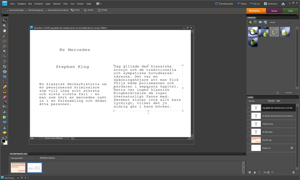
I use PSE to line up the typing with the cards. First I scan the card I want to print on and open it in PSE. Then I open up an empty document the same size as the card. In this case 4x6". I place the scanned image on top of the background, by dragging it to the empty document.


I then place seperate text boxes on top and write in the different sections of the card. You can see all the different layers at the bottom right of the screen.


Next click on the little eye icon next to the scanned image to hide it.


Next save as one layer, click yes to removing hidden layers. Print onto a regular printing paper. Then place the PL card carefulle in right spot on top of the paper and tape it down with washi tape.Some times I use pencil lines, and sometimes I just hold it up to a window figure out the correct spot. Run the paper through again, and carefully remove tape.

Yes, it takes more time than writing by hand but for me it's worth it. I'm not fond of my handwriting and it's way too messy for my PL style. I wish I had neat handwriting like Catherine Davis or Kelly Xenos but I don't.

Here's the finished page!


If you like the digi brush top right it is called "Sm(art) Mouth" by One Little Bird and Paislee Press and you can find it here. The gold splatters are rubons by Studio Calico. Find them here.

/Magdalena

Saturday, April 4, 2015

MEMORABILIA IN PL

This month I've been taking the Day By Day Chaos Control class at Studio calico. The focus is to add memorabilia to your PL pages. For me most memorabilia collecting is done during the summer, and I had quite a tickets, tags and wrappers to add last summer. Right now I love adding our childrens art to the pages I make. There is no way to hang on to everything they make, but scanning or photographing my faves is doable.

For this spread I wanted to add this sweet letter our son wrote. It translates "I love you so much to mommy and daddy from Dante". Worth keeping, right? 


I also made an insert for all the Easter crafts the kids brought home from school. So cute! Each photo got a little note on who made what. And the Make Something card by Tina Aszmus was so perfect for this page. So glad I got the Maker card set last month!


Have a lovely weekend everyone!

/Magdalena