Sunday, April 23, 2017

TWO WEEKS, SIX PAGES

Today I'm sharing another two weeks of our Project Life album. There were not enough photos from week 14 to make up an entire spread on it's own, so I just mixed to photos from both weeks togther.

I used a digital stamp from Studio Calico for the week in review card. I don't use that stamp much because it bothers me that it says Week ho, rather than week no. I went to find these tiny veneer numbers to add some dimension. All cards from Studio Calico's April kit Written in the Stars plus the Spring Break kit designed by One Little Bird.

Have you been watching Amy Gretchen's Project Life process videos? Love them! She's inspired me to do more stamping, and not just with the most recent stamps from the current Studio Calico kit. Before putting these pages together I went through all my stamps and picked out the ones that would make good embellishments such banners and tags. I stamped them all in black ink on a piece of smooth white cardstock. I've then been cutting them out by hand as I go. 

Week 15 was Spring Break, although in Sweden it's called Easter Break, and this page is a small collection of photos of what we did in the 10 days we had off. Crafting, playing, reading, hanging with friends and sleeping in!


I used the 4x6 photo templates vol. 6 from Paislee Press to create a collage from a series of photos I had of Nea posing with a pair of glasses she crafted from plastic packaging and pipe cleaners. The single acetate light bulb I had left over from an older kit went well with her bright idea!


On Friday the 7th of April there was a terror attack in Stockholm, Sweden. I record current events sparingly in our PL album because I think there will be other ways of learning about them in the future, however I felt that this event was imortant enough to go into our album. I found some photos online and paired them with the Big Alpha card set designed by Jasmine Jones. I was out of the letter O so at first I considered using a 2" circle punch on the photos but I felt that there were enough letters left in the word for it to be readable without the O's.


Three of the photos pictures classic stockholm sites (the royal castle, the concrete lions and the cherry blossoms of Kungsträdgården)and last photo shows Prime Minister Stefan Löfven laying down flowers for the victims.


I needed to use the back of this insert for something and decided to make it a place to document our favorite eats of the Easter weekend. The yellow flower card is from the Spring Break set linked on top. All other cards are cut down rounded corner PL cards from Studio Calico, and you'll also recognise a bunch of older stamps in use.


The bottom left cards is a super short recipe for our favorite homemade Easter candy bars. All they contain is mini marshmallows, melted white chocolate and rainbow sprinkles. Super easy and super delicious! The gooey marshmallows and the crunchy sprinkles are awesome together. You can use cookie cutters to make Easter-y shapes if you like, but we just do squares. Don't want to waste any of the goodness!


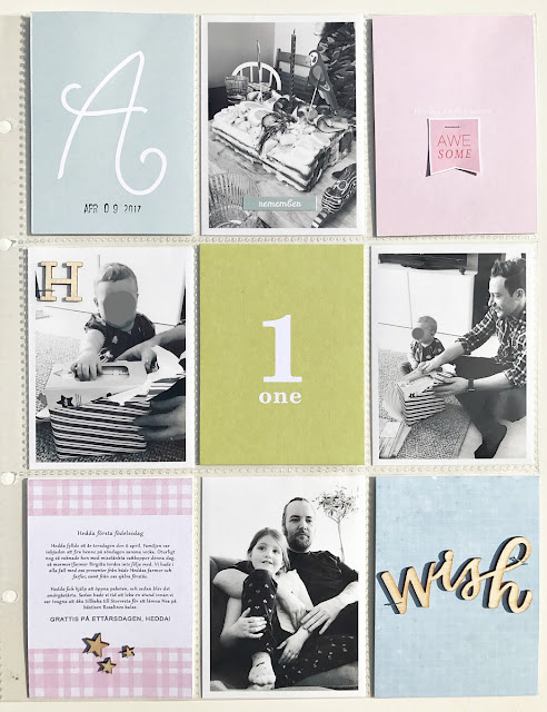
On Sunday of week 14 we celebrated the first birthday of my brother's daughter. These photos all went onto the same page. Sweet baby face covered for privacy! The awesome banner is from the High Five elements pack by Paislee Press.


On the back of this page I plan to put photos of the movies and shows we watched during the week. I haven't finished this page yet so I will share it on a later date! The last page of the weeks 14 and 15 are from the days of Easter. 


First up is the kids dressed up for the Swedish version of trick or Treating which we do on Easter Thursday. Kids make Easter greeting cards and knock on their neighbours' doors dressed as witches. The cards are exchanged for candy, originally collected in a coffee pot. Dante preferred to dress up as the Easter Bunny this year. I dug up a set of Easter themed cards from my stash. I think they may be from last year? I found a tiny veneer heart for the bunny's nose. It looked so sad, but the heart perked it up a bit! And the carrots from Tina Aszmus' Painted Veggie card set went well with the easter theme too.


I haven't bought (or used!) veneer embellishments in years, and I'm really dipping into my stash now. Any tips on where to find cute veneer shapes these days?

Enjoy spring (or fall if you're in the southern hemisphere) and I'll see you soon!


/Magdalena

Sunday, April 16, 2017

GOLDEN

Week 13 is all about golden colors. Some photos need to be printed in color, such as the one of our daughter's hair and that delicious tall glass of beer. And with that I had the week's color scheme set.


Again most products are from older Studio calico kits. I found the current kit hard to work with, and I've already used up the cards that I liked. I sliced the orange leaves card in half because it called too much attention to itself. The owl and floral cards are from a digital card set by LifeLovePaper. The numbers card is Ali Edwards and the "Loving right now" is another digital card set by One Little Bird.

I'm still digging into my veneer stash since my purge and scrap supply reorganising.  It's so much fun to rediscover older product.

The reading card is Studio Calico but you can make a similar one yourself using the Chapters Elements kit from One Little Bird. That's also where the book lover label can be found.


And happy 74th  birthday to my mom!


Tomorrow you will find the spread for week 14 on my blog, and if you didn't come by here yesterday don't miss out on my post for week 12.

/Magdalena

Saturday, April 15, 2017

REWORKING WEEK 12

We've all been there. Trying to put a spread together that. Just. Won't. Work. It's so annoying! You move things around, do your journaling, pick your cards. Hate it. Start over. Again and again. Right?

That was my week 12. I don't even remember how many times I went back to start over, trying to move things around to see if I liked it better. I ruined a whole bunch of cards and photos and I suppose I could've just left well enough alone. It's about the memory keeping, I know! But for me it's about pretty products as well and if I don't like what I make it feels pointless. 

I finally made it work when I put all the blue tone photos on the same page and went to find cards with the same dark blue tone on them. I didn't have enough dark blue cards to let the color carry over onto the second page so I went with baby pink for that one. 


I really like the quote cards from Studio Calico. One side has color and the other side is black and white. The tiny printable is cut from a card included in this set by One Little Bird.


I had also printed a book review, another One Little Bird product, but it smudged in the printer and I couldn't make it work with the rest of the products. Instead I added a folded piece of washi tape as a pull tab and tucked it behind the book photo. 

And, if you are looking for a nonstop exciting read I recommend this trilogy by Peter May. It's a murder mystery and a relationship drama connecting the present and the past twenty years back. And you'll learn a little Gaelic, too!


I've liked and pinned lots of colorful pocket pages lately and I really love those! But what made this spread finally work for me was picking a color and going with it. There are so many talented memory keepers out there who manage to get the multicolor layout to work for them, but I'm not able to do that. I'd love to find out what the trick is, that's for sure. Just look at these pages by Catherine Davis, Kelly Noel, Nancy Damiano, Jippo and Confettiheart
Multicolored pocket pages - that's a class I'd take!

I'll have another weekly spread up tomorrow, so drop by then. 

/Magdalena